
Let's dive into some emotions. We all know that feeling. Everyone experiences it one way or the other at some point in their life. At first, it feels like cataclysmic forces are tearing everything you know and value apart. With time it gets better but when it is only just beginning it's hard to imagine anything bringing you out of that space. My goal with this image was to use typography and and a little photo-manipulation to capture that feeling. I wanted to make something relatable and for me, this was a good place to start.
The piece itself:
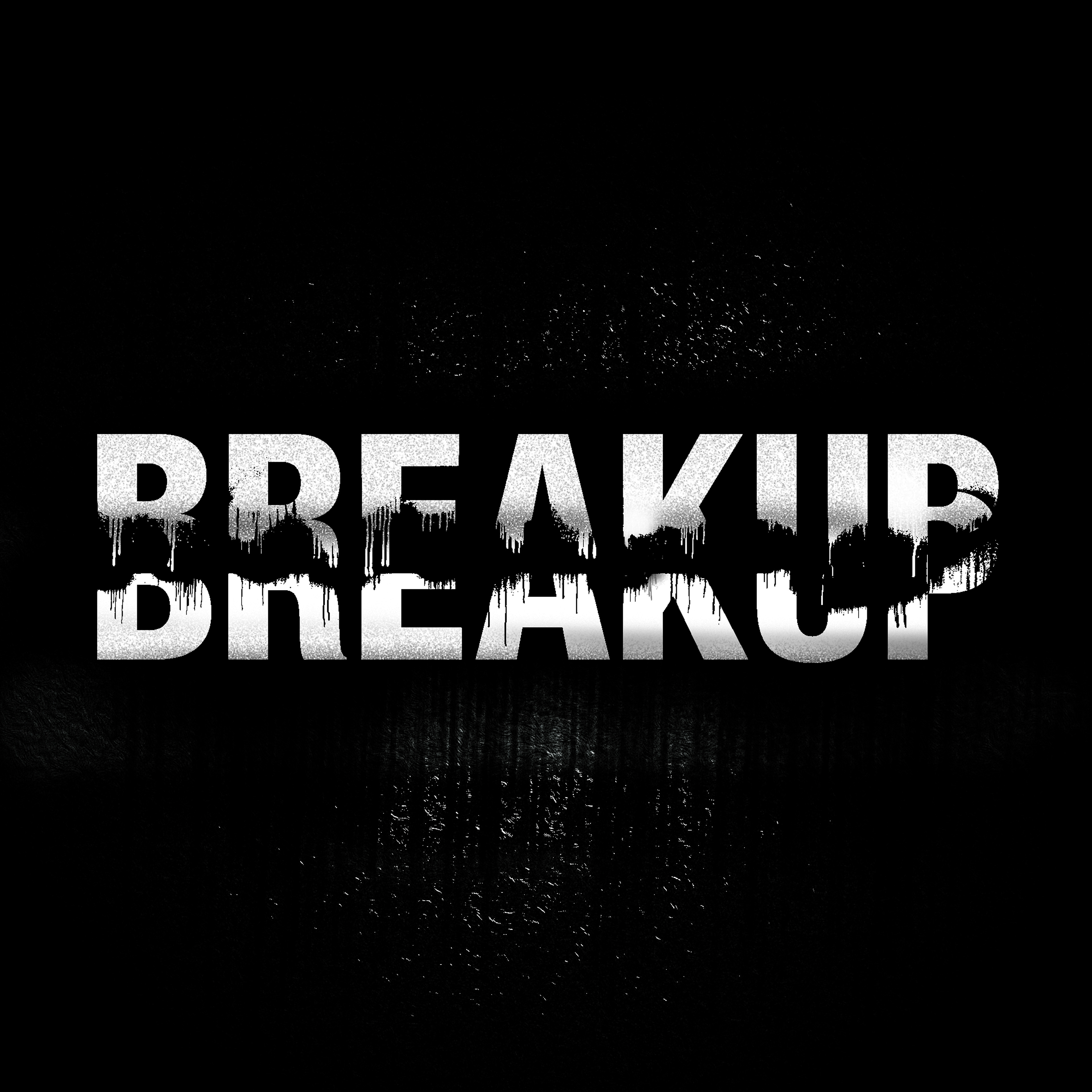
When you're making something that is basically just a word on a background, your choice of typefaces is rather important. I used Helvetica Neue LT Std 87 Heavy Condensed. I wanted something clean and almost traditional. It needed soft curves and unforgiving angles. Helvetica Neue fits that description. The typography stands in the place of the viewer and their emotions. Like people, it tries to look professional and inviting but under the circumstances it is placed into, it just can't keep up. The background is black so that the word feels isolated and a little ominous. The image also features added texture to further suggest a sense of disintegration. To illustrate the separation, I took two copies of the word and placed them on top of each other. I found some great photoshop brushes that helped to really distress the top and bottoms of the copies of the words and masked out the areas I wanted to disappear. The end result is what is featured above.