
A friend of mine, from Artificial Visuals, asked to collaborate on a branding project for a new company specializing in premium products ranging from beard oils to shampoos.
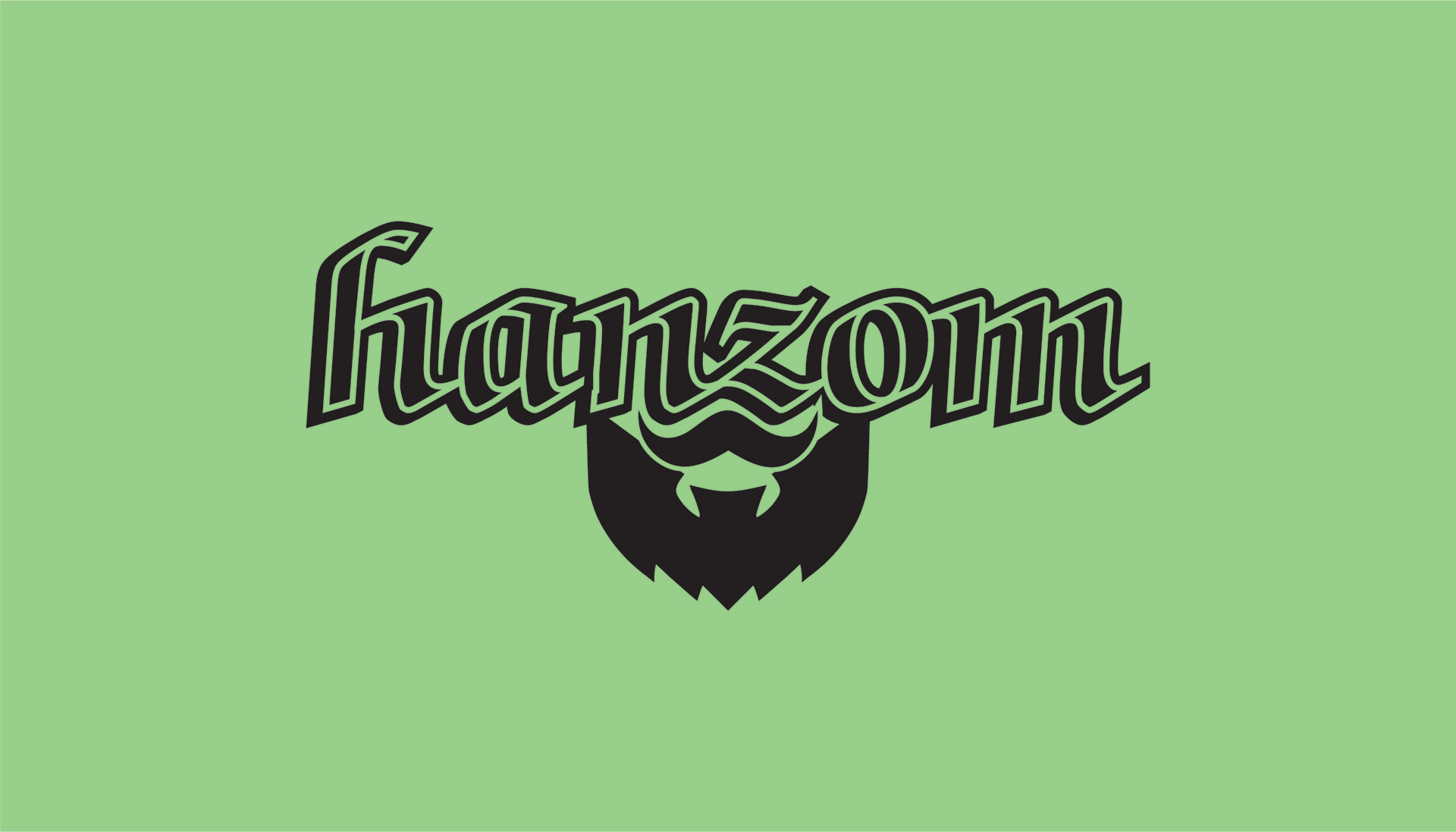
We tried a wide variety of looks. Initially we started off with a scripted font and a shiny "H" but established early on that this was too dated. From there, we tried a sleek and modern approach with a blackletter font and a beard underneath. This option, however didn't encapsulate the complete range of their products. The solution lied somewhere between vintage and modern aesthetics.
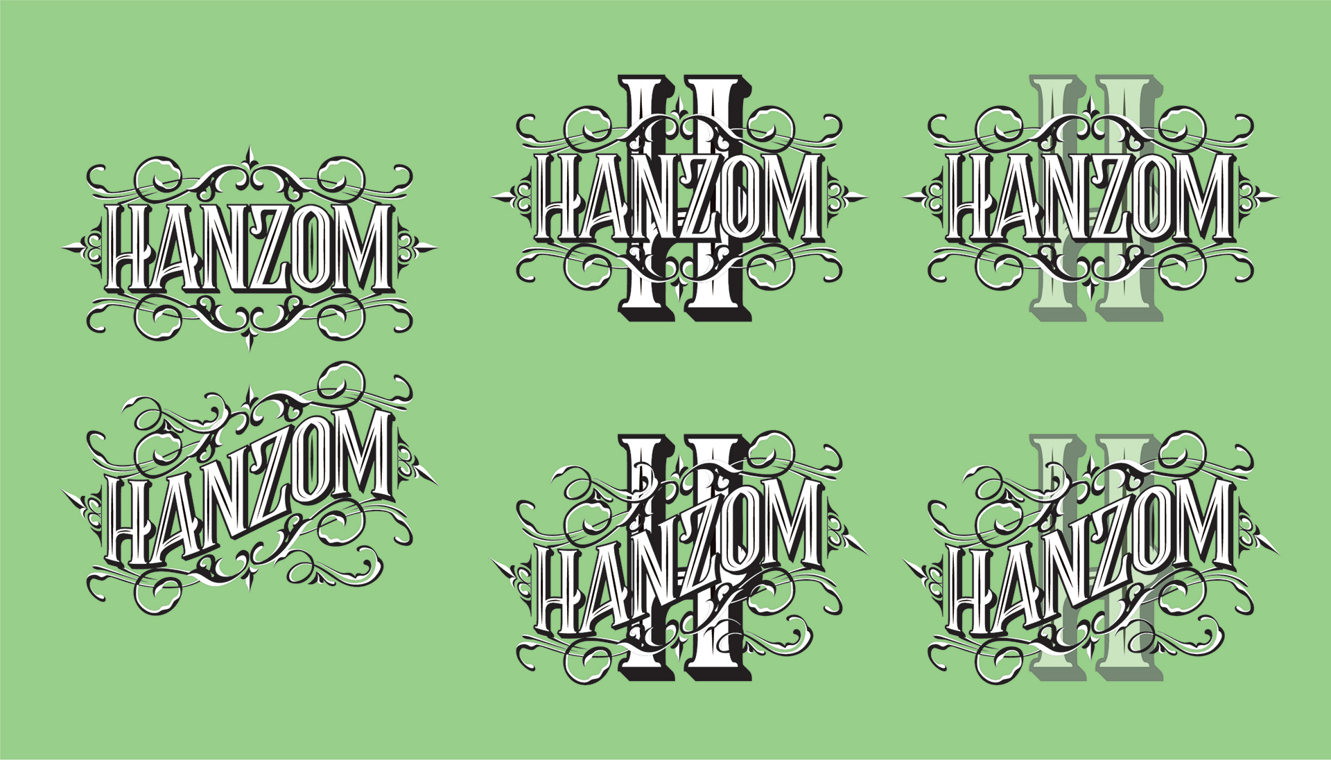
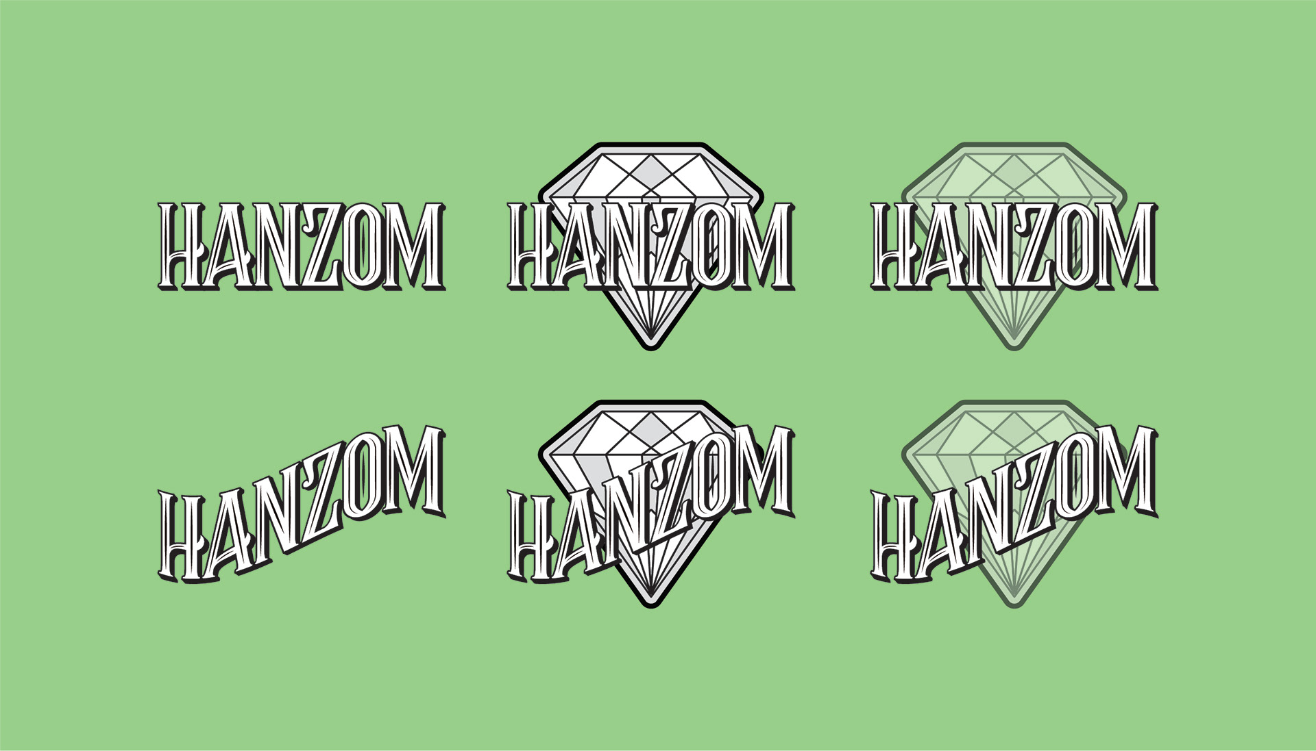
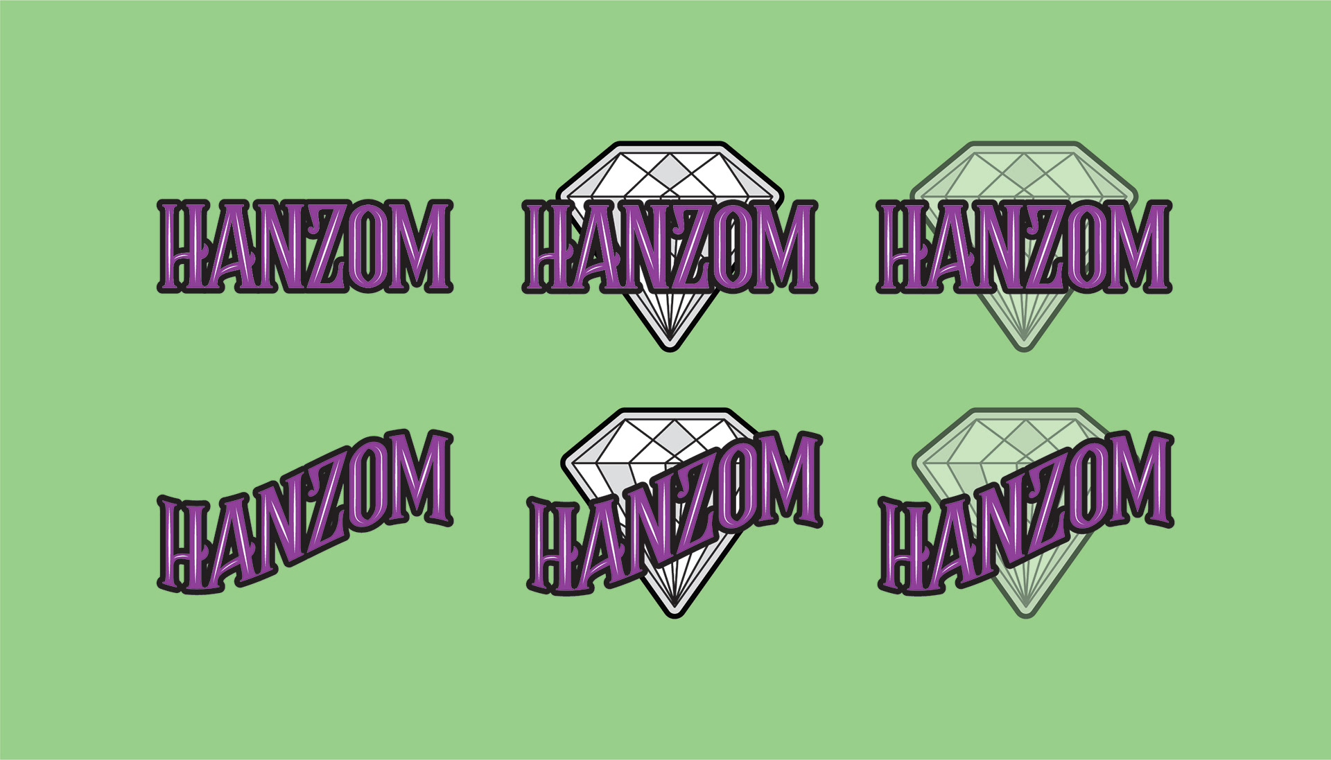
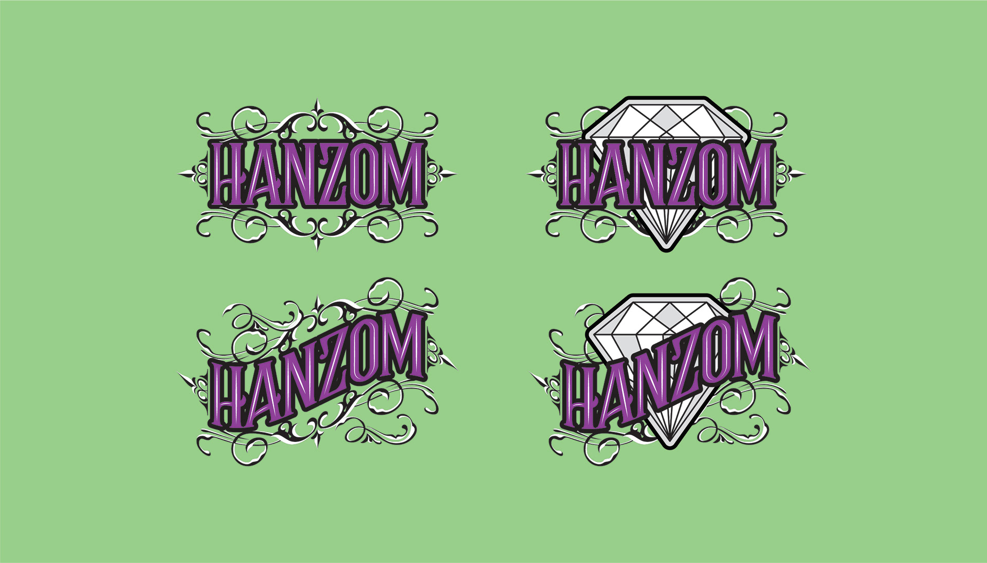
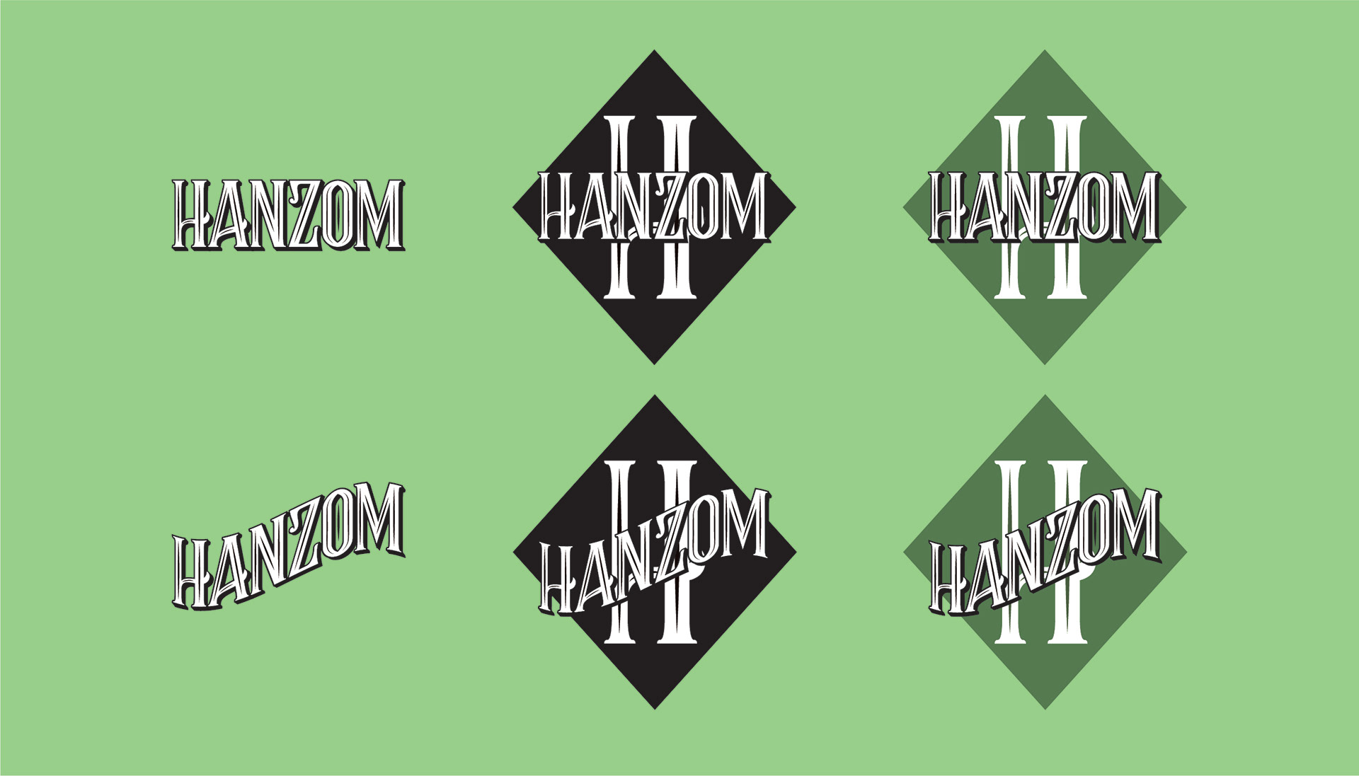

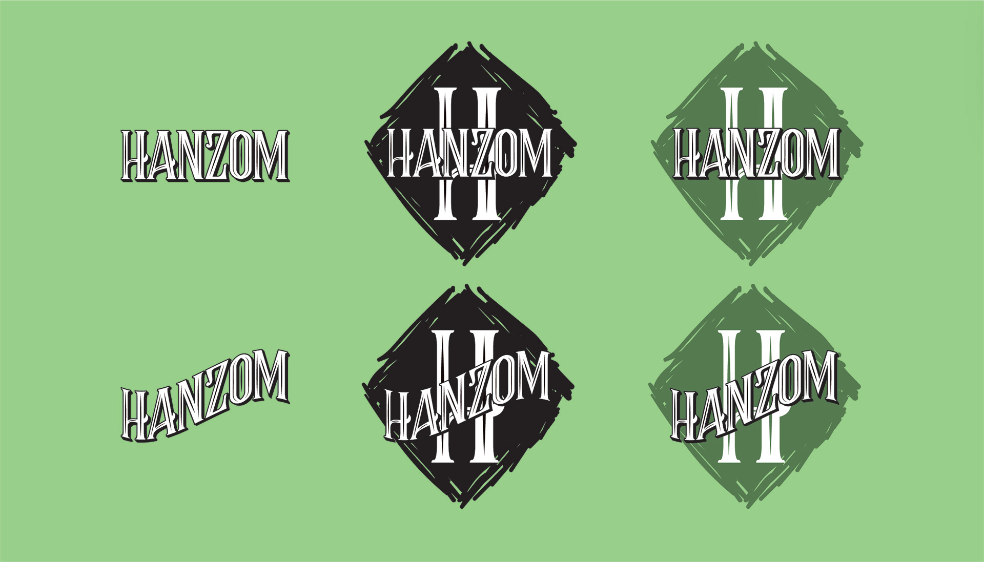
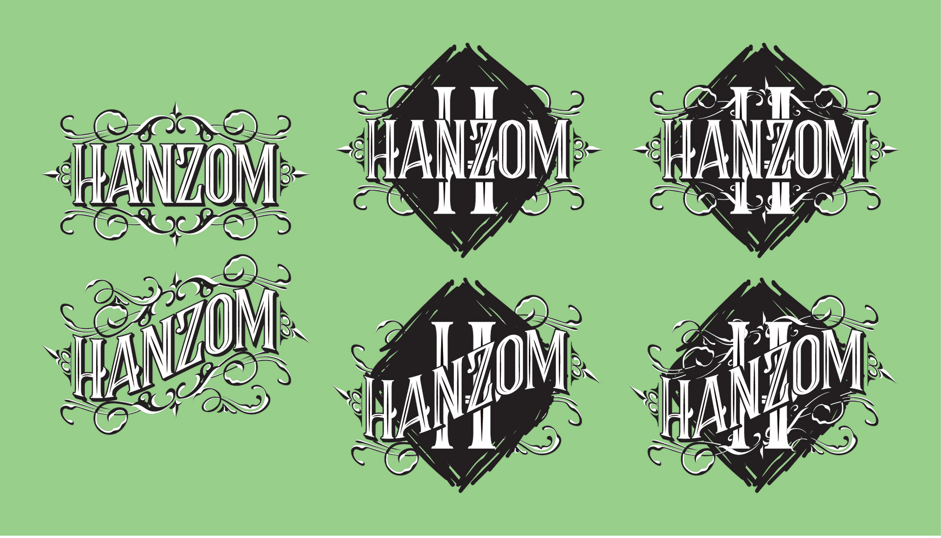

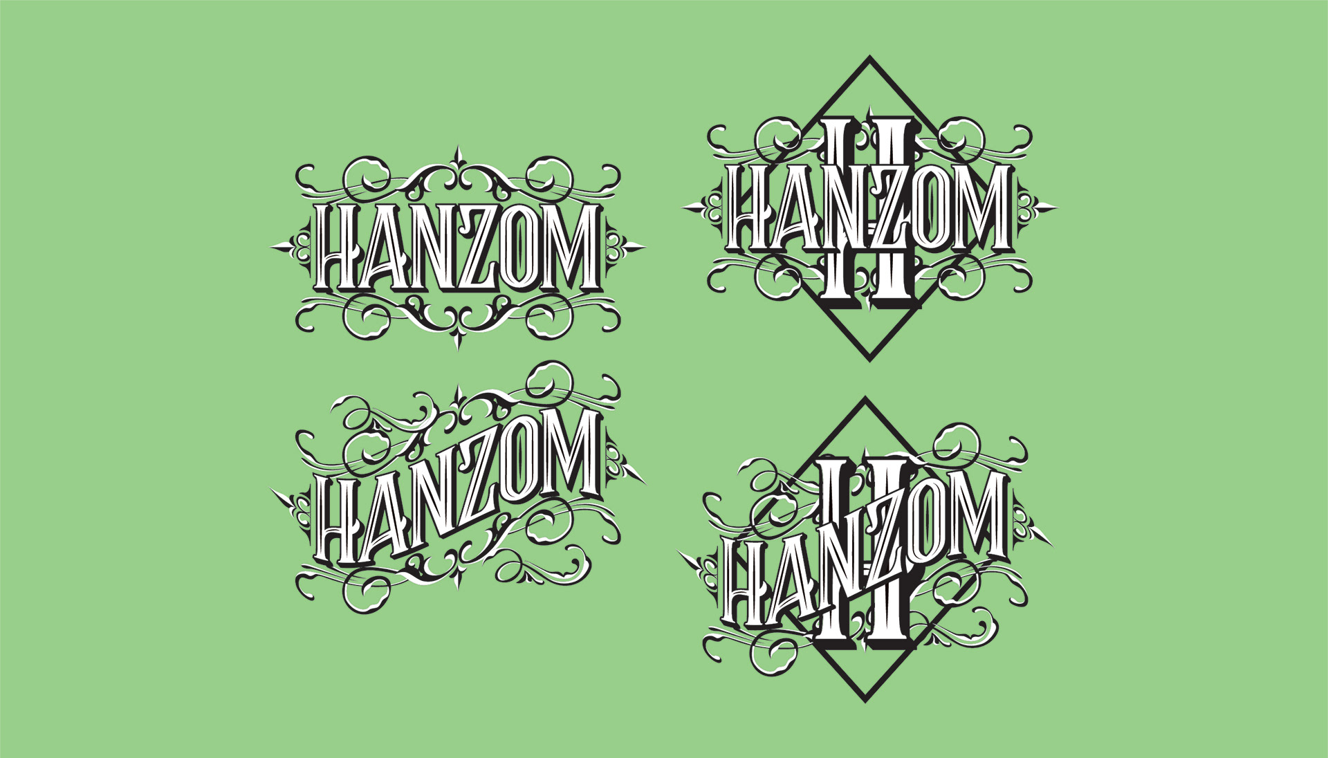
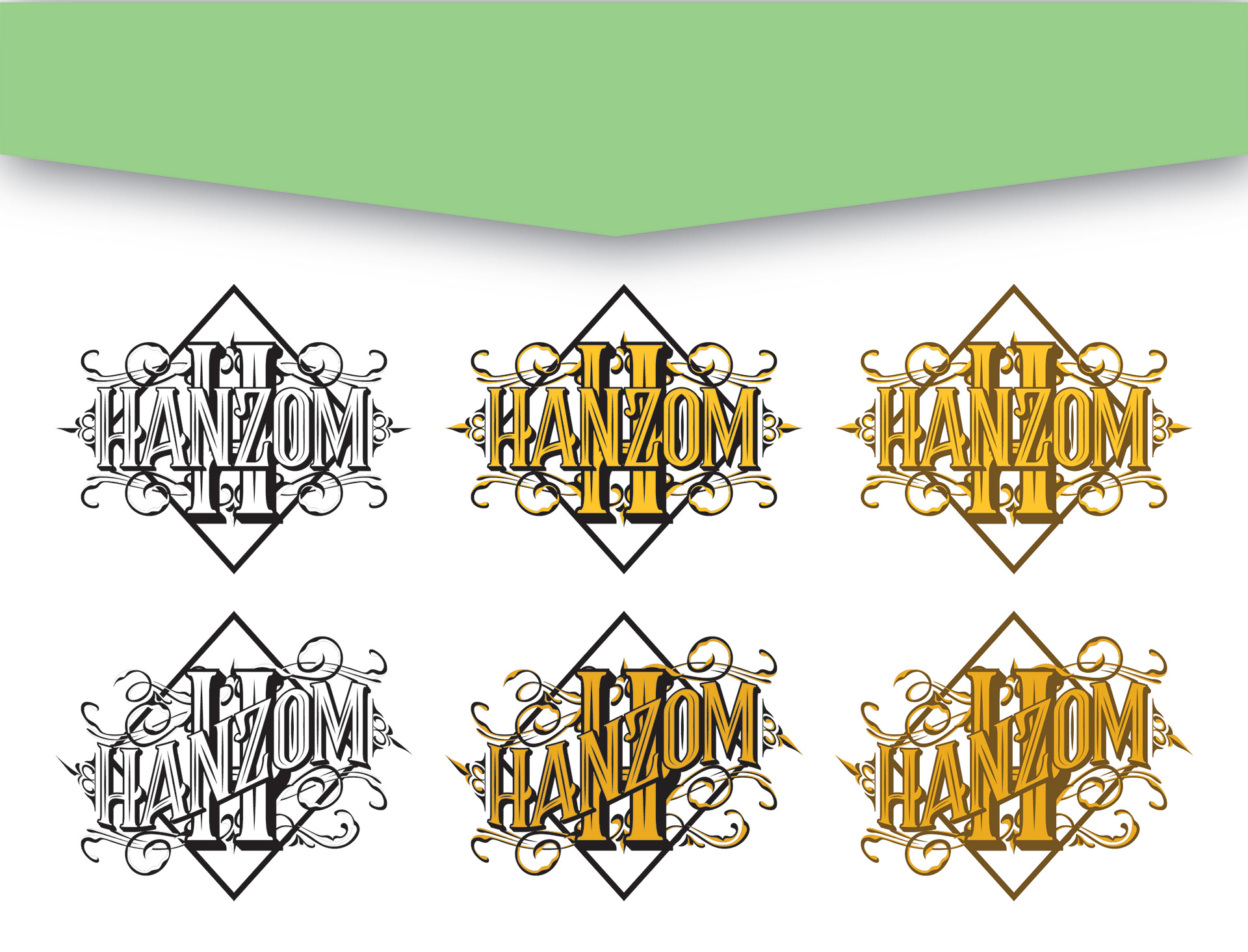
Once we established the typography we wanted to feature, I played around with different warps and flourishes. Normally I try to keep my logos pretty clean and simple but there is always an exception to the rule. The client drew a lot of inspiration from vintage packaging so I wanted to include some of those elements to give it a similar feeling. I also included a diamond in most of the designs at their request. Admittedly, I made the wrong kind of diamond at first (the rock not the shape) so I got some extra iconography practice. The diamonds ranged from outlines, to solids, to flat shapes, and expressive scribbles—with and without flourishes. All approaches were explored. In the end, we chose the options on the white background above. It was a fun journey exploring everyone's ideas and it gave me a great chance to explore some work outside of my day job.