
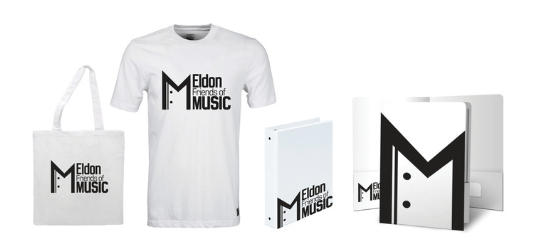
Eldon Friends of Music
The logo shown above is composed predominately of textual elements. It contains a simple sans-serif typeface paired with a stylized “M.” The “M” holds a lot of significance for the organization (which was in fact a real client). The left side is raised slightly up as if it is preparing for a sudden change or acceleration. The thinner line and dots on the left side are an allusion to a repeat sign (in music notation) but faces towards the right as a tribute to one of Eldon’s most beloved band director’s (Rex McCargar) signature phrases, “continuing the tradition.” By facing towards the right, the repeat sign signifies repeating the traditions that made the program succeed in the past to excel well into the future. The “M” also references the formal attire worn by both band and choir students during concerts. By doing this, the logo represents the music department as a whole; and thus, is not limited to either the band or the choir.
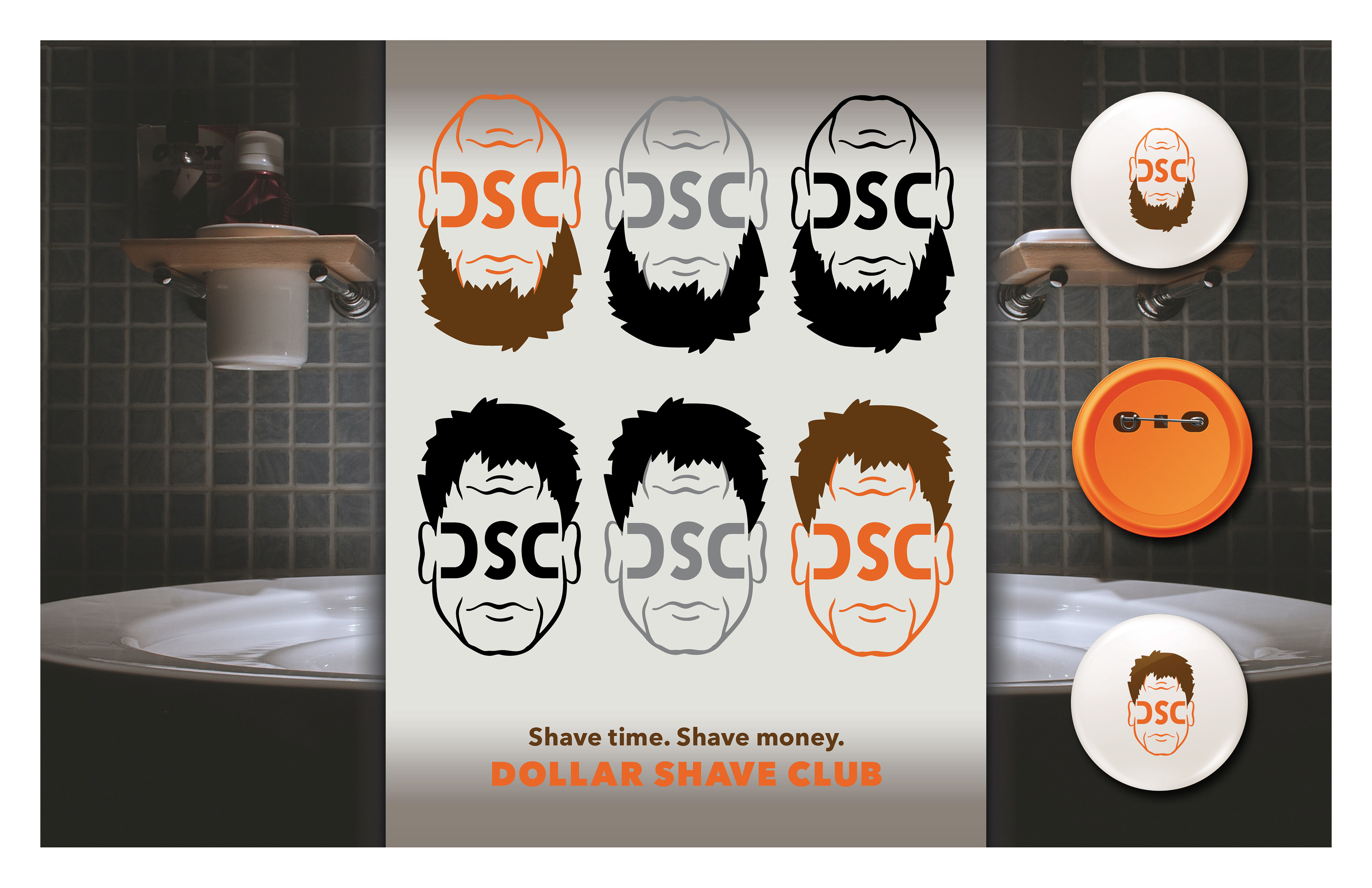
Dollar Shave Club Ambigram
This logo utilizes Dollar Shave Club’s signature color pallet and manly appeal to create a logo that works from two different perspectives. From one direction, the logo depicts a clean- shaven man. When rotated 180 degrees, the man becomes bearded. To avoid the logistical nightmare of making two sets of eyes and a nose blend well when flipped, I placed the text in the middle of the face where these elements would normally be located. Elements such as the chin and mouth, however, function as wrinkles when flipped in opposing directions.
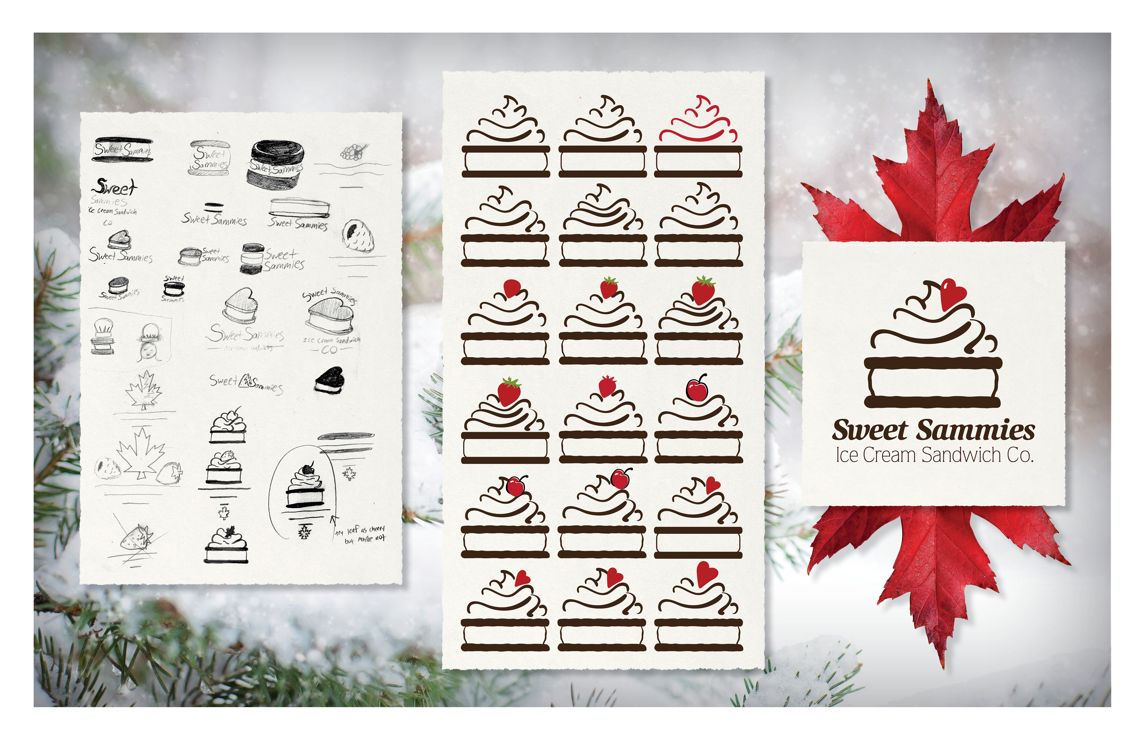
Sweet Sammies
This logo was created for a small company in Canada that makes excellent ice cream sandwiches using high quality ingredients. The overall feeling that the company portrays is a cute/light/sweetness that mimics the sugary appeal that many feel when thinking of ice cream. In their original logo, the company utilized a typeface paired with a heart as the dot for their “i.” As both a colorful accent and a small tribute to their former logo, I added the heart as the cherry atop a delectable ice cream sandwich.
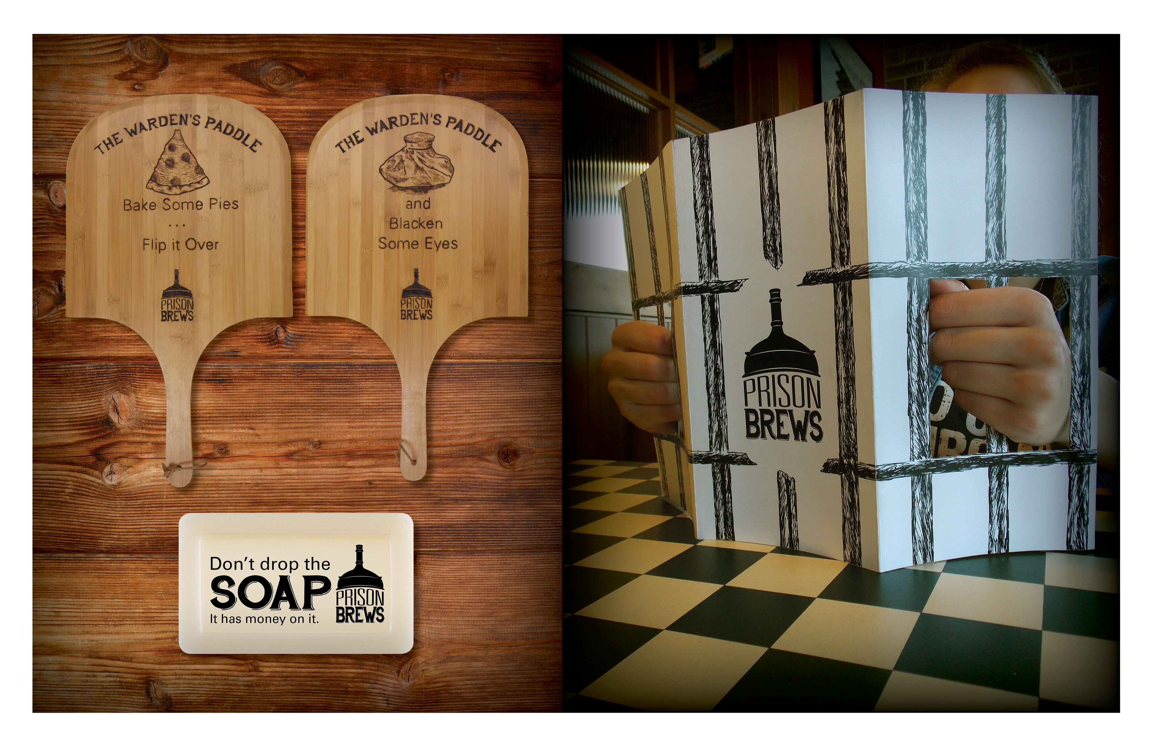
Prison Brews
This project required me to re-brand a restaurant and microbrewery in Jefferson City, Missouri called Prison Brews. The logo features a still paired with a vintage typeface that compliments the historicism of the penitentiary that the restaurant claims as its namesake. I also created a menu which gives the viewer the appearance of being incarcerated when viewed from across a table, a cheeky soap gift card, and pizza peel; affectionately referred to as the "Warden's Paddle."