
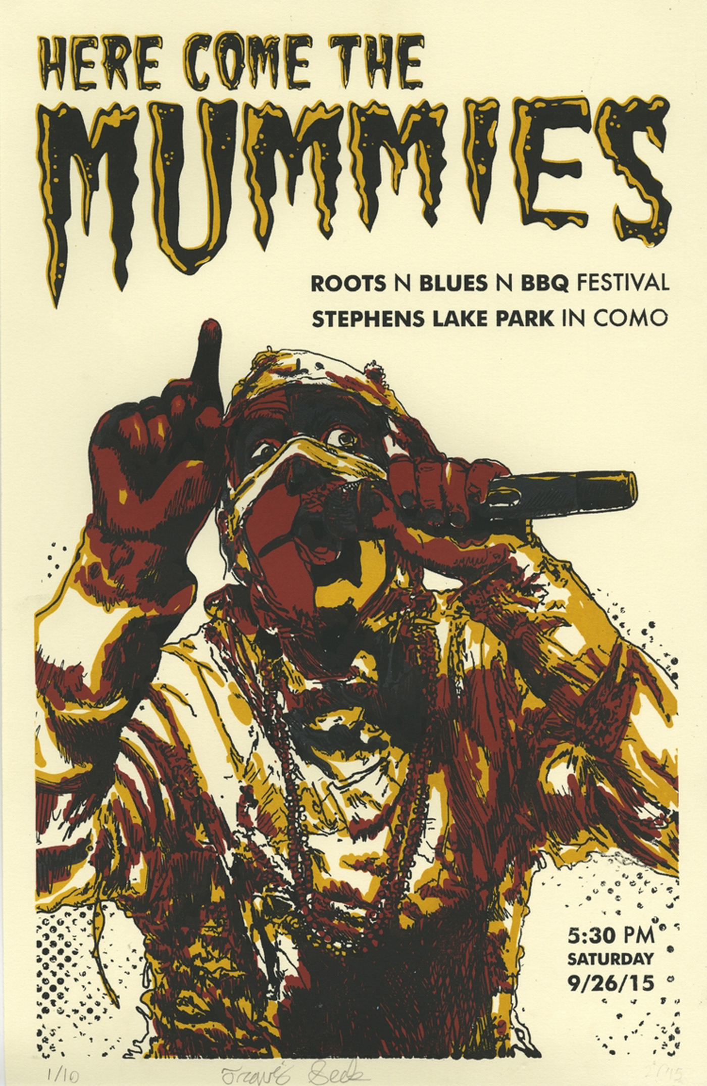
Screen Printed "Gig Poster"
This project, completed during Printmaking II, called for a series of prints with at least three colors and was required to advertise an event within the following two months. My poster was composed of four colors (Yellow, Red, Dark Grey, and Black) and featured the band Here Come the Mummies. Due to resolution limitations I chose to feature only one of the mummies, Java, who happens to be my favorite.
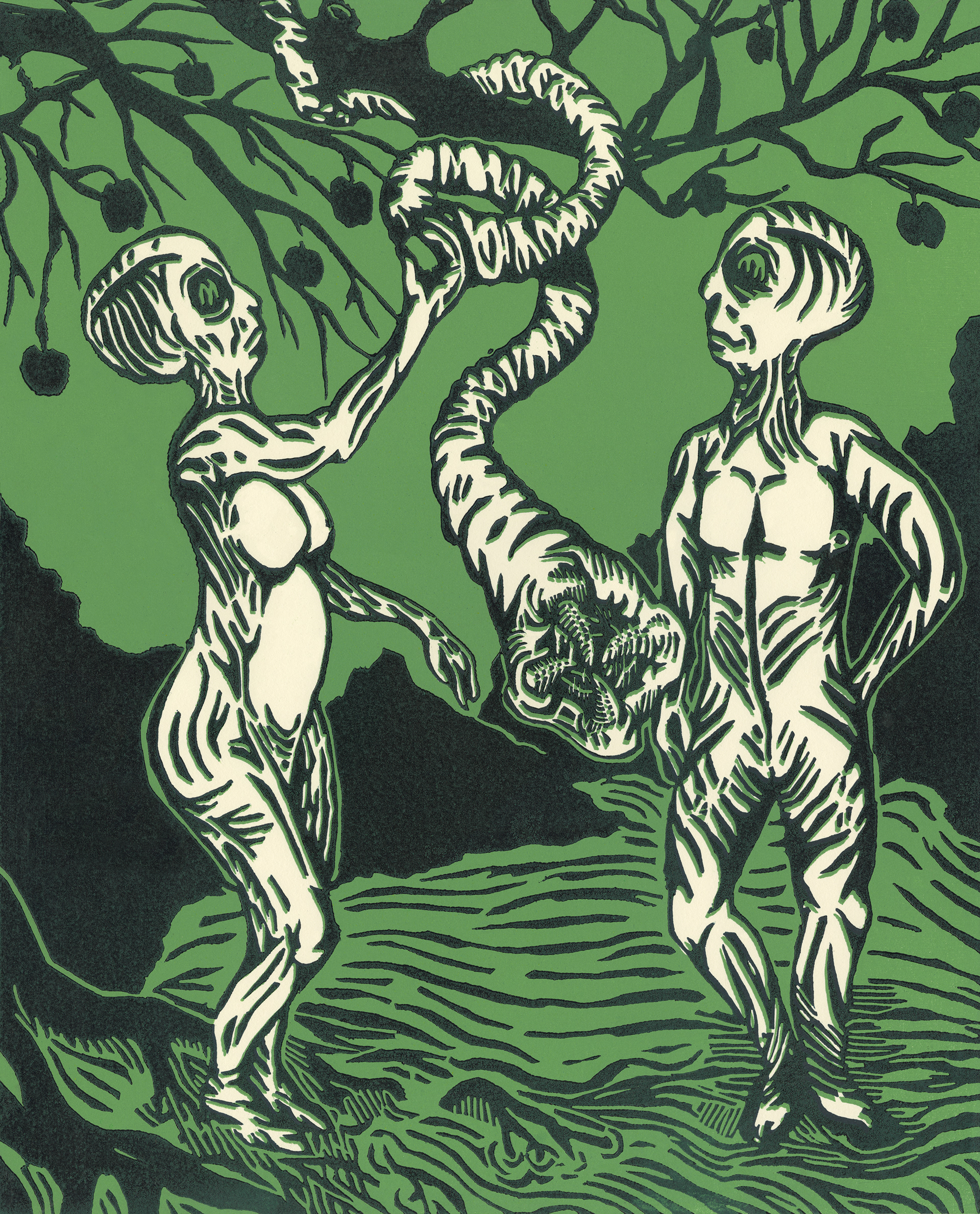
Extra Terrestrial Adam and Eve Woodblock
For this assignment, I was asked to chose between a conspiracy, a hoax, or a natural phenomena and print a pictorial representation of my choice through a two-color reductive woodcut. For my piece, I chose to illustrate a conspiracy theory that suggests that Adam and Eve were actually super intelligent aliens. The composition alludes to more classical depictions of the "fall of man" while also referencing contemporary illustrations of alien life-forms in modern pop-culture.
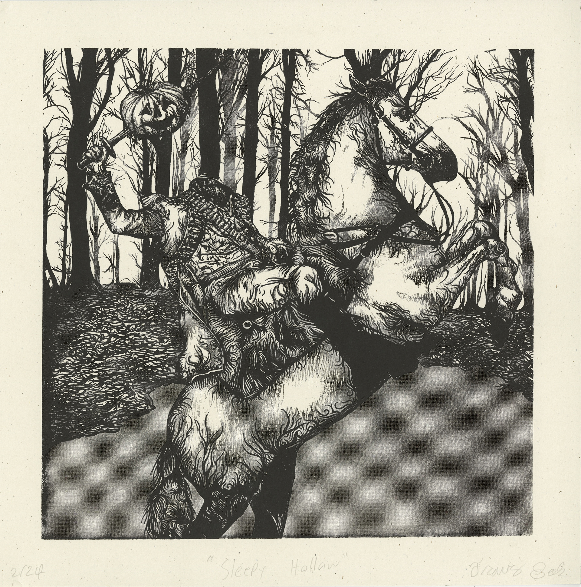
Sleepy Hollow
This print was a one-color screen print on speckle-toned French Paper. It features a vector drawing that I spent three weeks creating. It was then bitmapped and transferred to a screen for production. This project was my first true opportunity to experiment with screen printing value shifts using bitmapping.
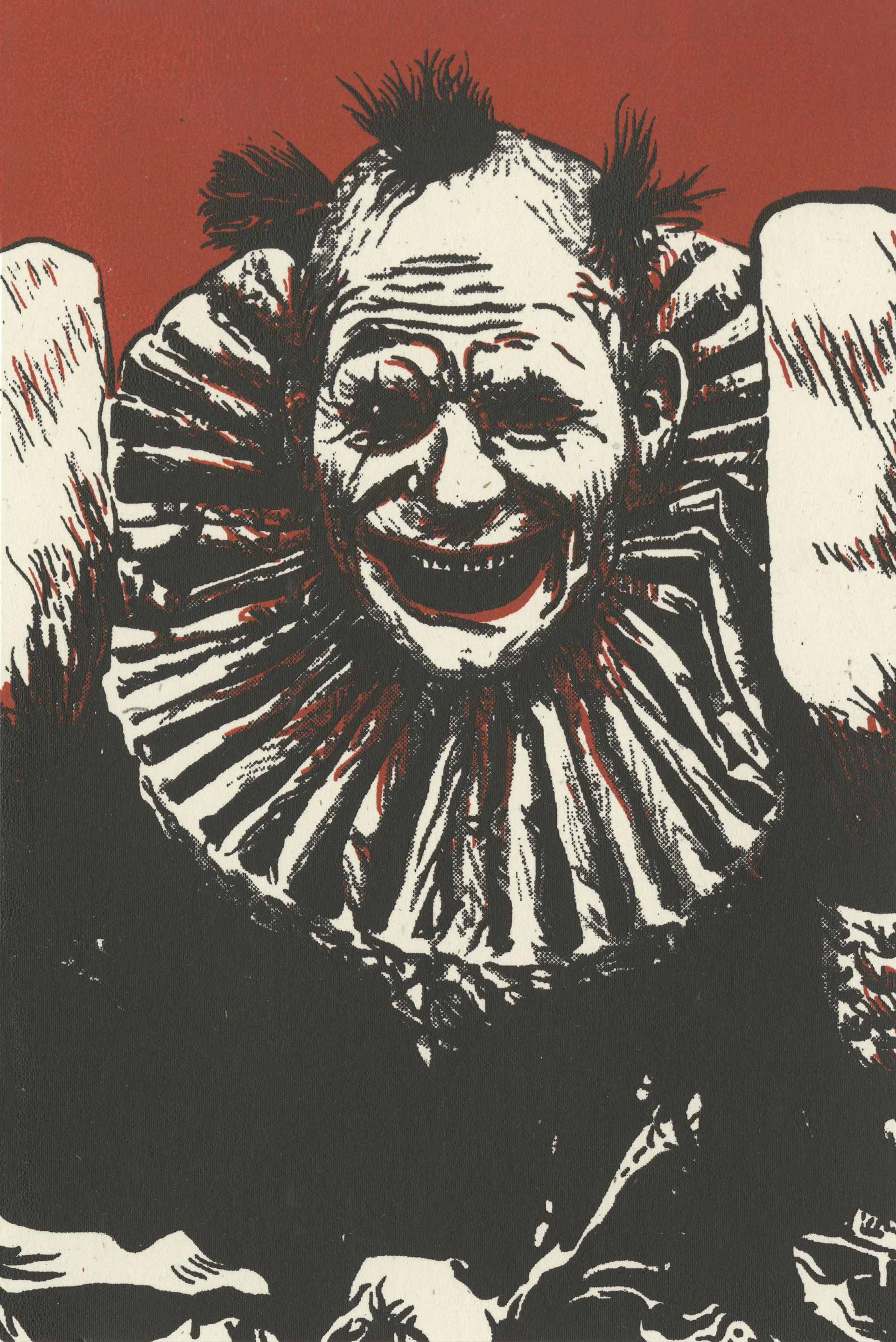
Creepy Clown Cards
This print was designed as a two-color screen print at a size of 6 x 4 inches. Originally the design was at a higher resolution but due to screen issues I decided to try printing the cards using a screen with a lower mesh count. In the end, the lower resolution screen gave the image an even creepier look than the original design which lended itself well to the original intent of the design.
Funny story about this piece:
During the critique, we joked that my professor had become possessed by the clown. He kept hanging up more and more prints from this edition until eventually nine prints were hanging on the wall.
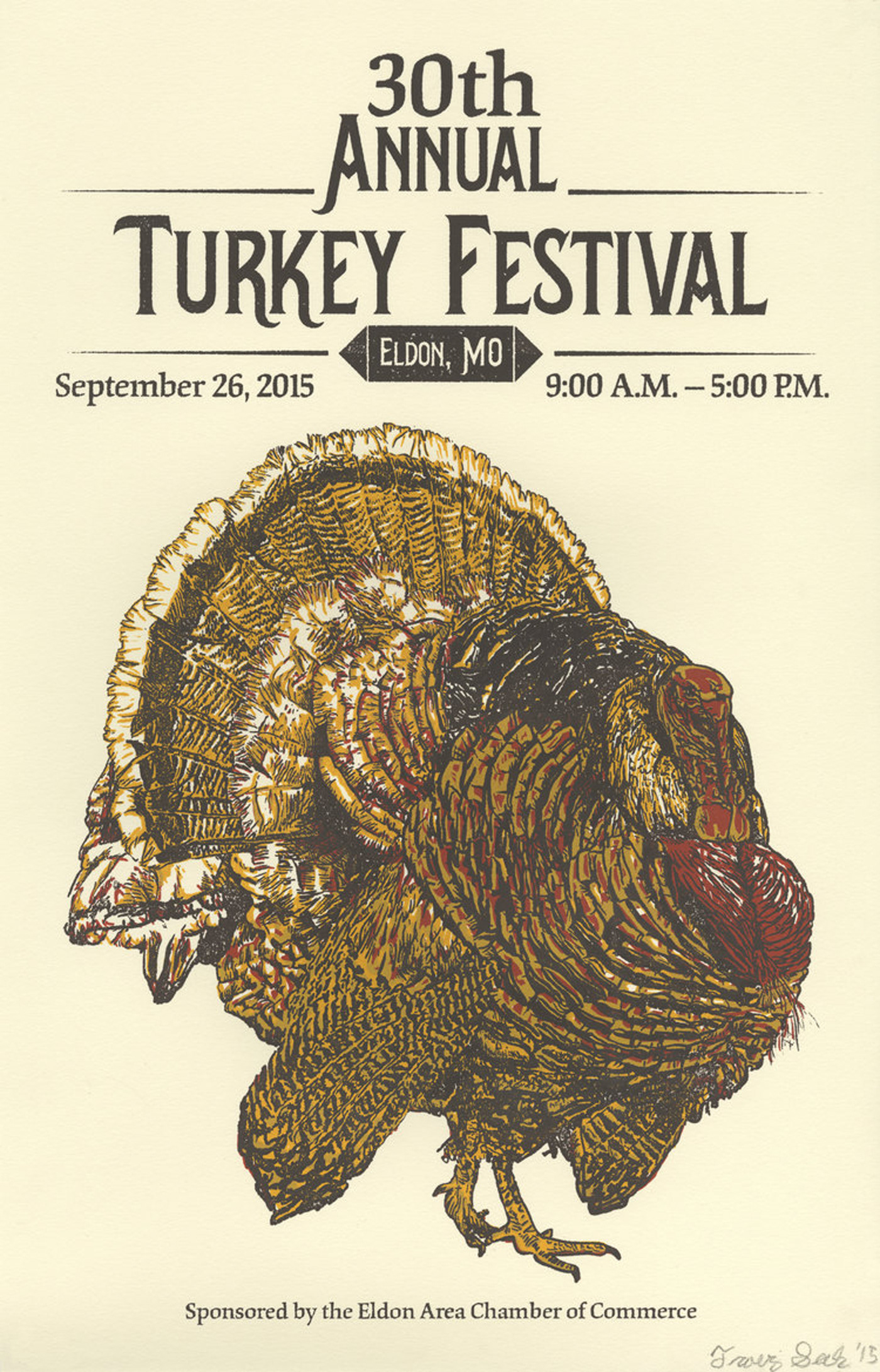
Turkey Festival Poster
This poster is a three color screen print that I created for Printmaking III. The turkey itself took four days to draw but I felt that the time spent adding the finer details proved to be well worth it. The event the poster was created for was an annual festival in my hometown (Eldon, Missouri) and was featured on promotional items for the event.
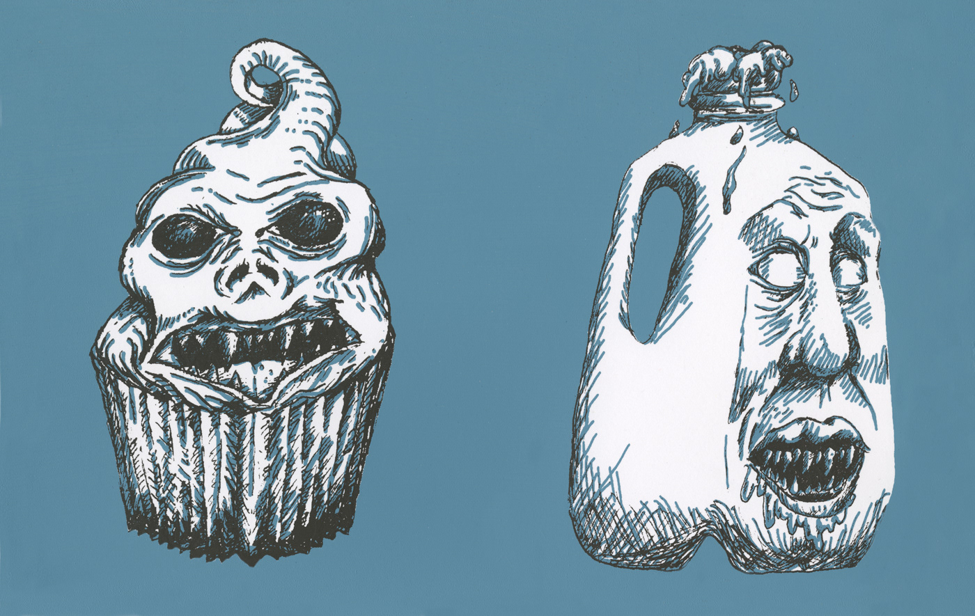
Nightmare Food Afflictions
This project called for the creation of a two-color series of screen printed images depicting a nightmare of some sort. While talking to my sister about her gluten intolerance, I developed the idea of personifying foods that are commonly known to be particularly harmful to individuals with certain diseases yet harmless to others. Depicted in this image is a gluten (cupcake) monster and a milk (lactose) monster.
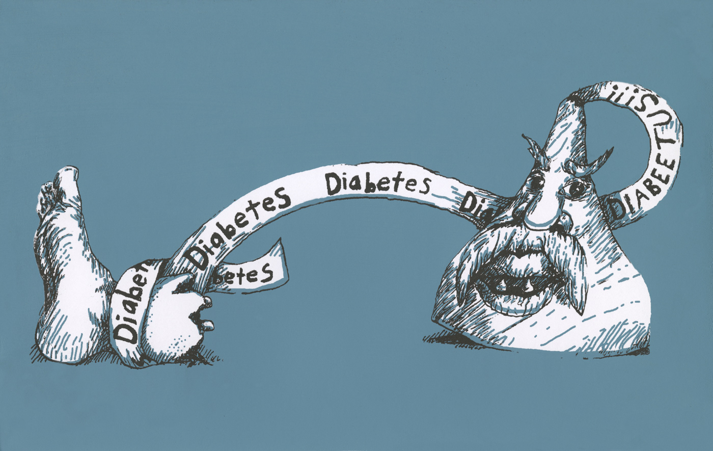
Nightmare Food Afflictions
Depicted here is the other half of my Nightmare Food Afflictions series of prints. In it, we find a chocolate kiss monster pulling away the foot of its victim. In a light-hearted way, this print strives to expose the horrible nature of this common disease. The print alludes to diabetes's destructive power over limbs (particularly toes) as well as references its famous TV spokesperson, Wilford Brimley, through his iconic mustache and the written-out pronunciation of "diabeetus;" which, has become a viral sensation through social media memes.
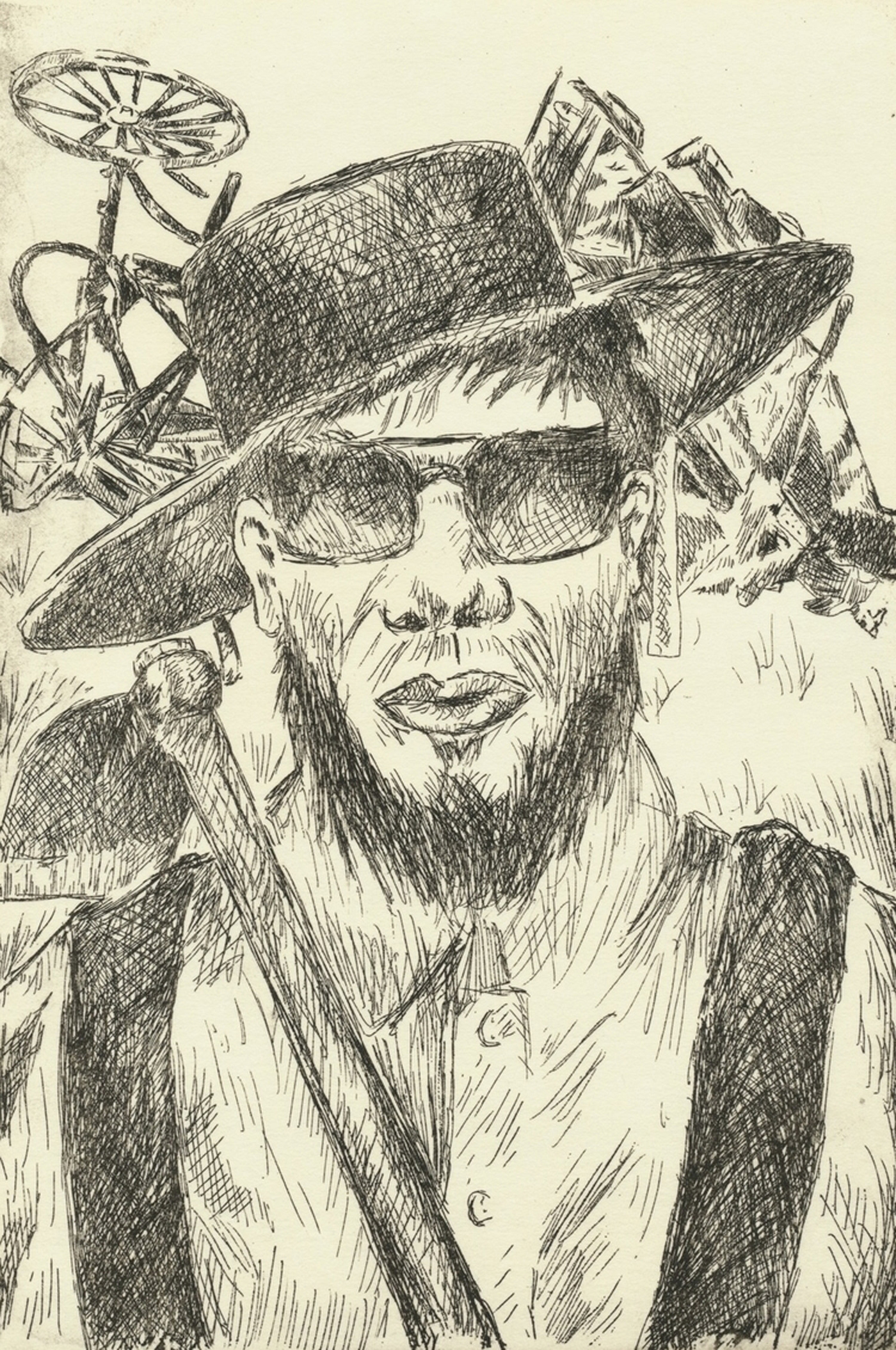
The Bishop's Advocate and His Hoe
This print was created using the intaglio process and is a "tongue-in-cheek" depiction of a fictional amish gangster standing in front of a destroyed carriage while holding a gardening hoe. The project called for us to illustrate a group of people (fictional or otherwise) using the intaglio printing process. For me, I felt that a fictional group of "amish gangsters" would be an interesting concept considering the amish are known for being humble, hardworking, and nonviolent. The contrast between reality and the fictional content of the print was, for me, what made this a successful illustration.

Dockery Gymnasium
This print was a 16 x 20 inch woodblock printed on Japanese Awagami paper. It took many hours to design and around 20 hours to carve. In the end, I felt that the hard work paid off and the results were well worth the time spent. This was an incredibly fun project for me and I look forward to doing many more.
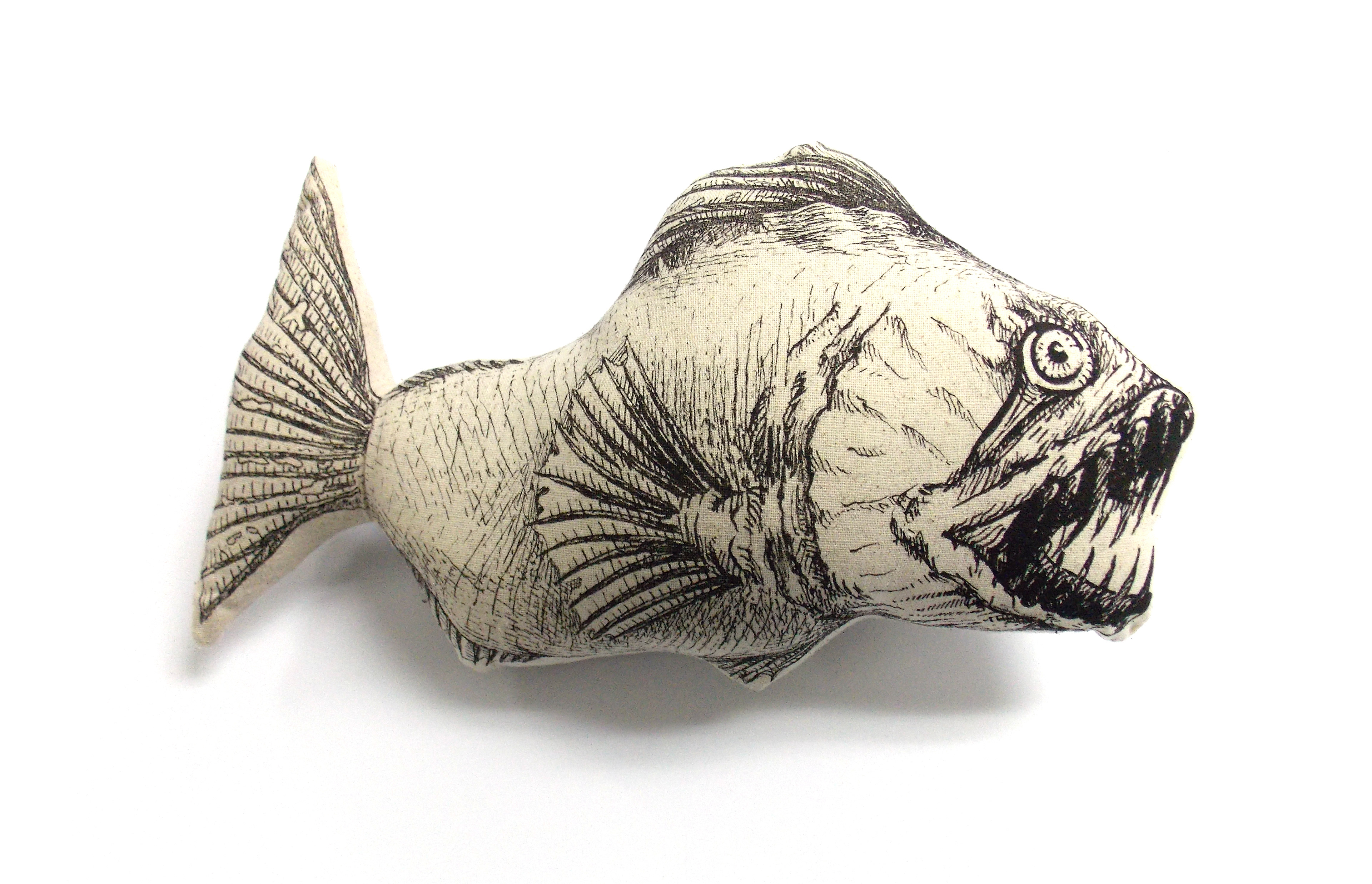
Creepy Fish Pillows
These comfy neck pillows are frightening, adorable, and oddly relaxing at the same time. The tail fin tucks behind the neck of the viewer and allows them to lay their head upon their shoulder at an angle that does not create strain. They were hand illustrated, scanned, screen-printed, sewn together, and stuffed using durable yet soft materials.
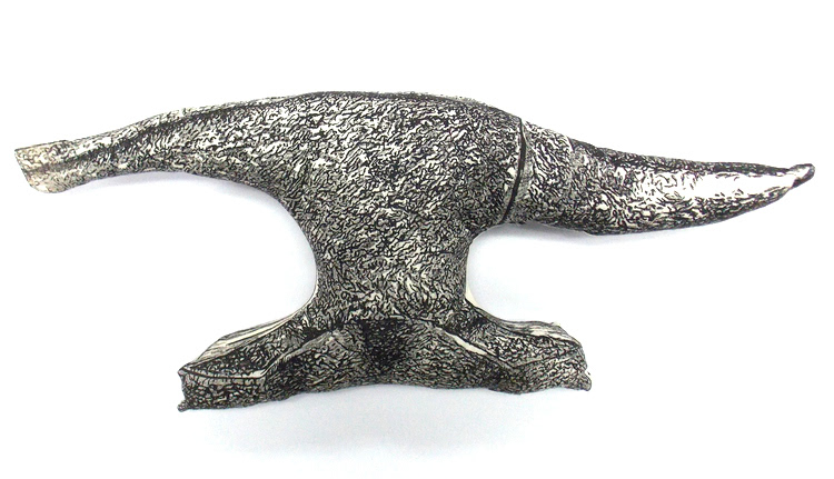
Fluffy Anvils
This print series consisted of plush anvils that were constructed by sewing screen printed pieces of fabric together and stuffing them. What really made the project interesting was seeing how the stuffing warped the original form. Turning a hard object into a soft and floppy pillow was a little unsettling but by no means an undesirable result.
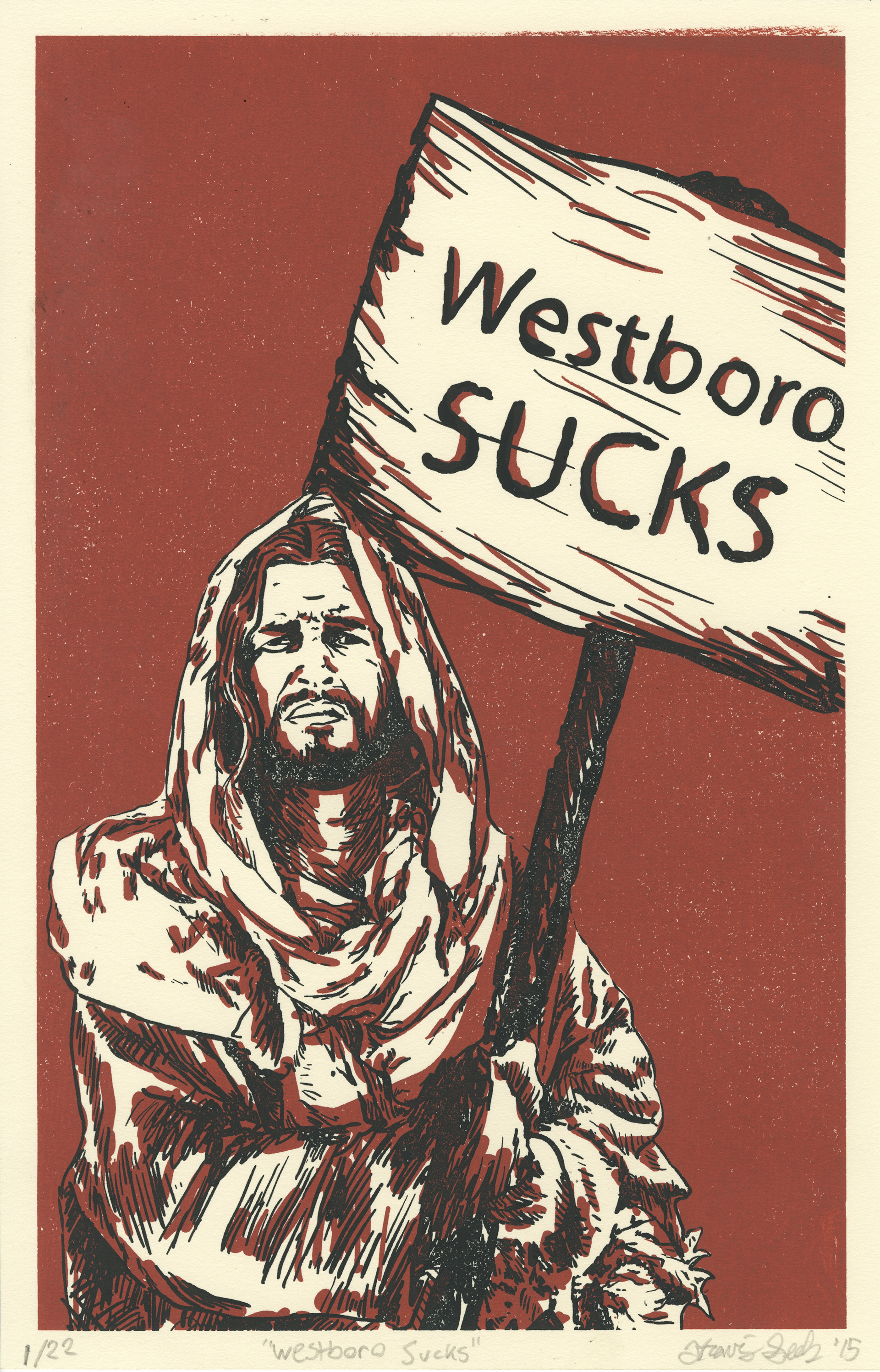
Westboro Sucks
This screen print embraces an admittedly controversial statement that simply reads; "Westboro Babtist Church sucks." I'm assuming that most people know of the WBC; but, if this is not the case for you, I encourage you to look them up (at your own discretion). I typically shy away from such load political commentary in my work but this assignment called for me and my fellow classmates to make a propaganda piece. In my illustration, I have Jesus holding a sign stating that "Westboro Sucks" just as the Westboro Baptist Church holds up signs claiming that God hates everyone else. The choice of using Jesus as the central figure was risky. By doing so, however, the message hits much harder and is put into context much quicker.

Spaghetti Monster
Admittedly, I had no good reason to make this print other than I thought it would be a really cool drawing. Illustrating the vast quantity of noodles featured in this piece was also a great challenge in regards to skill and patience.
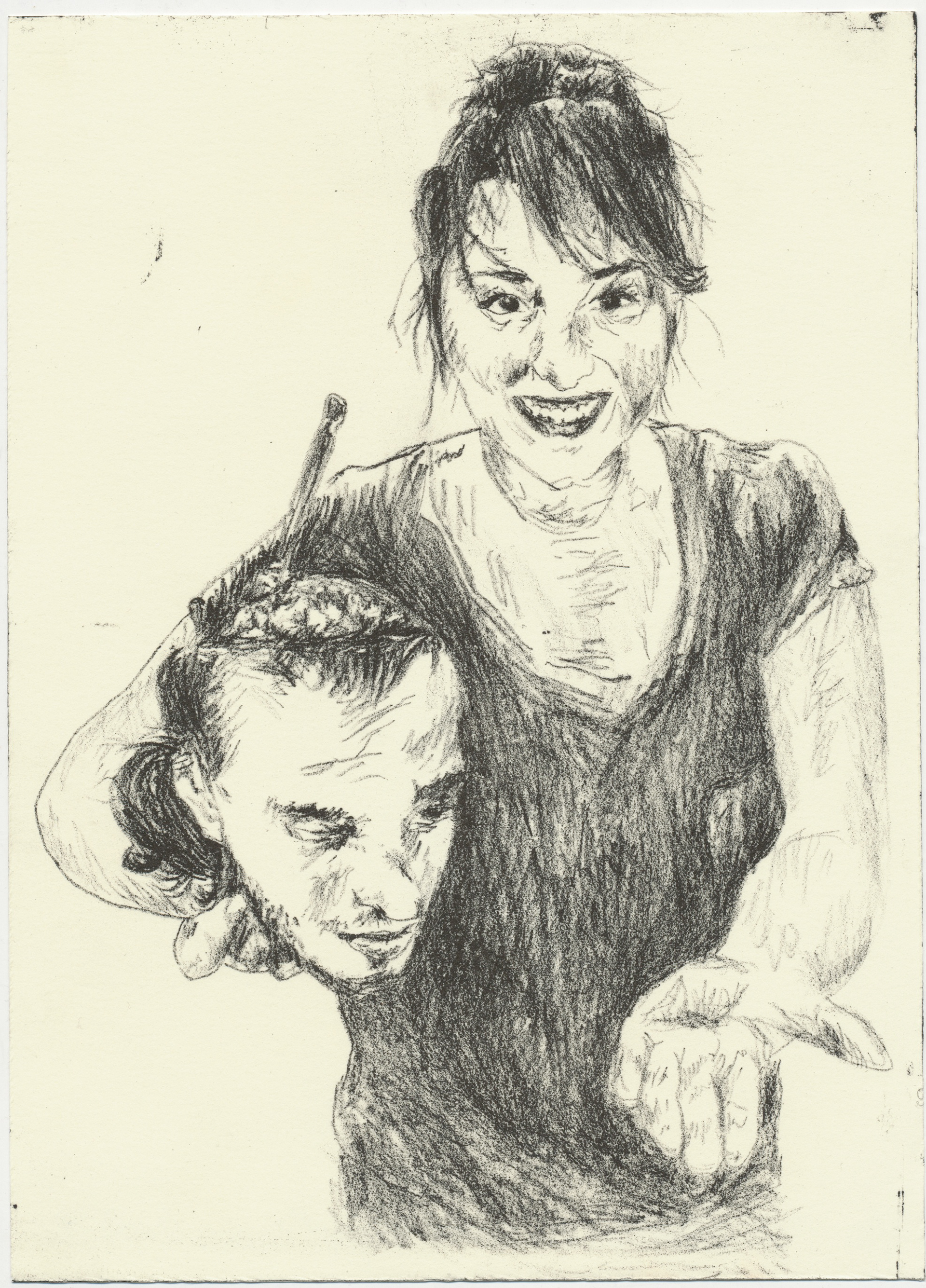
Oh Schmitz! It's Cannibal Krysta
This print was an inside joke. It features a friend of mine, Krysta, holding the head of another friend, Matt Schmitz, as if he were a fancy h'orderve. Matt is affectionately nicknamed Matt Sh*ts so I used a play on words to give the print a more personal yet humorous conotation. Both friends were very pleased with print although it was quite entertaining to explain to Matt's mom what the basis of the print was.